.png) Created this stationary for a fictitious cosmetics company. The logo concept I came up with was to put a woman's face in an apple, and to have her hair also double as the bite out of the apple. Not all that unsuccessful because nobody sees it until I mention it. The other concept I came up with was to make the business card look like an apple hanging from a tree. Not so obvious either. I guess I need to work on that. There are a number of other areas that the design could be improved on, but I was already into the grace period for this assignment.
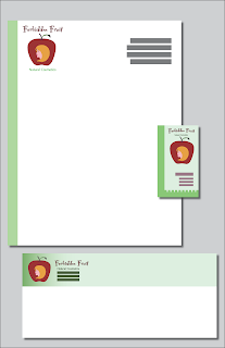
Created this stationary for a fictitious cosmetics company. The logo concept I came up with was to put a woman's face in an apple, and to have her hair also double as the bite out of the apple. Not all that unsuccessful because nobody sees it until I mention it. The other concept I came up with was to make the business card look like an apple hanging from a tree. Not so obvious either. I guess I need to work on that. There are a number of other areas that the design could be improved on, but I was already into the grace period for this assignment. Thoughts? Suggestions? Advices?
Just for the record, Franco is a child. Arnold is the father.

