

I read The Metamorphosis this week. Kafka is the shit. Read it if you haven't already.
 Yeah, there are all of three people that read this blog, but if you're interested in sponsoring my participation in the CN Tower Climb for WWF Canada (April 17th), please visit my fundraising page.

.png) Created this stationary for a fictitious cosmetics company. The logo concept I came up with was to put a woman's face in an apple, and to have her hair also double as the bite out of the apple. Not all that unsuccessful because nobody sees it until I mention it. The other concept I came up with was to make the business card look like an apple hanging from a tree. Not so obvious either. I guess I need to work on that. There are a number of other areas that the design could be improved on, but I was already into the grace period for this assignment.
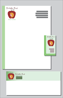
Created this stationary for a fictitious cosmetics company. The logo concept I came up with was to put a woman's face in an apple, and to have her hair also double as the bite out of the apple. Not all that unsuccessful because nobody sees it until I mention it. The other concept I came up with was to make the business card look like an apple hanging from a tree. Not so obvious either. I guess I need to work on that. There are a number of other areas that the design could be improved on, but I was already into the grace period for this assignment.  This assignment was for Foundation Colour. It was done in gouache, and the assignment stipulated that we had to make use of all the primary, secondary and tertiary colours (hence the garish colour choices). We were required to derive all the secondary and tertiary colours using only the primary ones - hence the terrible red violet comforter.
Drawings of Veronica Lake for George Brown Art & Design Foundation. The assignment was to produce two line drawings of the same subject, using a detailed approach for the first drawing and an economical approach for the second.
You could put all the talent I had into your left eye and still not suffer from impaired vision. - Veronica Lake
I will have one of the cleanest obits of any actress. I never did cheesecake like Ann Sheridan or Betty Grable. I just used my hair." - Veronica Lake